Friday, December 19, 2014

Moonlight and the sun - A couple of contrasting landscapes

Here's a couple of recently finished landscape paintings. Though both are featuring trees, they couldn't be more different in atmosphere, and time of day...

Under the shade of the oak
Acrylic on wood      28X36

The first of these, is a 'classic' Californian view with an oak in the foreground and strong over head sun. The day I took my original notes and reference it was a little cooler than normal, but still I was appreciative of the shade the tree offered.

The foreground and tree was a joy to paint, but the background took more time. I tried a few different color versions of receding hills, before settling on this. Despite it's alla prima appearance, the painting was slow to grow to completion, and was painted gradually over many months.

*
Moonlit colors
Acrylic on wood      22X34

'Moonlit colors' was a great challenge, it had been years since I had attempted a night scene, but one evening when the moon was full and strong I felt compelled to take notes on the colors and trees. I then attempted to recreate the ambiance of the scene in my studio days later. I enjoy the process of painting from memory, I feel it often breeds more heartfelt creative work.

Thursday, December 11, 2014

Rainmonds Staprans inspiration

Late in the summer I experimented with some ideas from looking at Rainmonds Staprans work. I find his work to be immensely exciting!

 A R. Staprans painting
 
Few artists are able to achieve the balance between 'color-field' and 'form' (or 'content') as well as him.  He also composes his frame in a very modern style; with focal elements placed in what would traditionally be thought of as poor or bad locations. Staprans never falters in this,  his composition choices never appear ill chosen, and always exemplary. (the images of his work I've shown here are maybe not the best examples of this, but a quick google search will give you many examples). 

For further study of the artists work, I would also recommend the book 'Raimonds Staprans - Art of tranquility and turbulence' by Karlstrom.
 A R. Staprans painting

I wanted to take a little flavor of Staprans work, and fold it into my more usual compositional and color choices of my still lifes.  To tease the edges of my work and it's usual conformity. In occasionally, doing this sort of thing, I feel it's a good way to come to terms with your work and where it's growing too. Maybe to resolve in your mind a direction that may work, or may not?   At any rate here are the fruits from that labor...

Stargazing with a hint of Staprans
30X30                 Acrylic on canvas

 Detail


Detail

Thursday, November 6, 2014

Santa Fe's 'Paint Out' Festival

 Tulips ablaze in the sun
28X24               Acrylic on panel

A couple of weeks ago I spent a few days in New Mexico in Santa Fe. I was there for a group show opening at Ventana Fine Art, and the 'Paint Out' festival. The event and show was a huge success and I sold a number of really nice pieces to happy collectors. 

The festival event offered by the arts biased town, allows artists from a number of galleries to paint in the streets through the course of the day. Visitors (of which there were many), are allowed the opportunity to see a great variety of art being created before their eyes, in insightful and creative ways.  Many collectors visited me more than once to see how my painting evolved through the course of the day.

I didn't finish it in one day. I'd made a start to painting the night before, and then worked through the festival day. I got it a long way there, but the final brush strokes were completed last week in my studio. 
Painting during the day


Go here to see more work Ventana Fine Art

Contact the gallery for more information, or a brochure.

VENTANA FINE ART GALLERY
400 Canyon Road, Santa Fe, NM 87501
Tel (505) 983-8815


 Opening night. Myself with artist friend Frank Ballam.

A few of the paintings I had on display.

Saturday, November 1, 2014

'Additions and changes' or 'Is it ever really finished?'

Campanula and jug on long table
20X47.5       Acrylic on wood

Is it ever really finished?... Well in this case I'd have to say yes. I originally painted and finished this painting in 2009, I only hung it once with a gallery in Scottsdale Arizona for a while.  I'm not sure why I didn't give it more exposure, but recently I took a look at it and felt like a change. This happens from time to time, I wouldn't say there's anything ever wrong with the old painting, it's more that my ideas and stylistic choices have changed or evolved a little and I want to incorporate some of those ideas into the old painting.

I think as artists we always want to go back and adjust or tweak works. I think of Velasquez's famous painting Las Meninas, and the adding of his red cross (the Order of Santiago) on his clothes many years later. Possibly the vainest, most unnecessary adjustment ever? But who am I to judge. Of course there are many other examples of painters revisiting works and adjusting or changing.
 Velasquez     Las Meninas

It's the curse of the artist to always want to change, add or adjust. In many ways, it's what we have trained to do. We're always looking, analyzing, critiquing; so why not cast that same gaze on an earlier finished work?


The 2009 painting before it's adjustment

You'll see from the details below, I kept the flavor of the painting in the new additions and changes. I allowed for a lot of under painting to show through, the colors of the purple/violet table reacting beautifully with the new warm table hues.

The patterning within the table cloth was kept loose and clumsy, breathing life into the table cloth. There's a risk when reworking to get too tight and careful; and much of this painting had been carefully rendered so it was important to keep things loose and fresh.

 detail
detail

Tuesday, October 21, 2014

A recent commissioned painting

A recent commission I did for a collector. Happy to say they loved it!
It was based on an older painting that had sold long ago.  It's in a slightly different size, and it was fun to redesign and distort the subject to a square format.


Cyclamen on patterned cloth revisited 
Acrylic on panel                         24X24

Just for interest, below is the original it was based off. They're pretty close, but you can have fun playing spot the difference on a few elements, aside from small color and tone changes.

Cyclamen on patterned cloth
Acrylic on panel                         18X24

Saturday, October 11, 2014

Photographing still life subjects

Spent a long day photographing still lifes arrangements. The list is long and time consuming to collect. Everything must be brought together; the fruit, flowers, vases, pots, drapes, cloths, tables and lights.  Who knows what will be needed to create the perfect arrangement. All this work before even the arranging can begin.


Then meticulously I arrange each grouping, attempting to make each different from the last.


 My aim is to create a number of photographs from each session that I can turn into a variety of paintings. I don't want too many paintings from each session, but I want enough shots to feel the time was well spent. Nothing makes my creative juices flow and excites my 'still life' passion like a new photo shoot!


The goal of this rush of activity was to create some really nice reference material for next weeks trip to Santa Fe.  The town hosts an annual 'paint out' event, where artists from a variety of galleries come out and paint!  #Ventana_Fine_Art, has a group show opening on the Friday the 17th, and the 'Paint out' event is on the Saturday. Looking forward to visiting beautiful Santa Fe again, seeing friends, gallery staff and artists! Tel (800) 746-8815 for more info.


I think I got shots that will work really well, looking forward to getting cracking - Now the fun begins!


Tuesday, September 30, 2014

'One on one' art workshop

Over the last couple of weeks I've given 3 days 'one on one' private teaching. Good fun and a great opportunity for an artist to really get to know not only 'what makes me tick' and how I approach my work; but also to really dig down deep and explore their working method and style.

This intense and direct process gives far greater granularity and focus than I'm able to give in my usual 'group' workshop teaching. It allows me to focus in on specific areas that the student wants to explore.


 Delphinium with Apricots and Poms
24X18               Acrylic on panel

This painting I completed on day one, as part of an introductory demonstration.  I didn't get it 100% finished, since I spent a lot of time talking, explaining techniques and covering other art techniques & processes. I made the finishing touches to it  over a few other sessions.

*

During the later workshop days we worked on a lot of 'challenges' or 'painting exercises'. They sound dull, but are a great way to break out of bad habits, and make new ground. Additionally,  many of them are great fun too! We explored simplifying complex forms and designing good color schemes.  I haven't posted visuals of these tests for the blog, but perhaps I should photograph them and post them later?

The painting below is a 'little one' I produced while the student was working on theirs. I like these small grouping of objects;  I love the way they can still clearly define a message and style despite the simplicity of the subject.

Above - Early days. (Photo taken at an angle, so you can just see the set up in the background.)


Lemons with a pair of reds
14X11            Acrylic on panel

Wednesday, September 24, 2014

Point Lobos Seascape

I love trips to #Point_Lobos (near Carmel, CA). It's such a beautiful coastline and has yielded many wonderful paintings. There's so many small headlands looking down onto small coves or inlets of beautifully clear ocean waters. The trees stretch out precariously over the edge.


I enjoyed working on finding the right temperatures in the colors of this painting. Balancing the violets and greens with the colors of the ocean. The distant headland balancing both the composition and the overall color palette.


 Across the cove
24X25        Acrylic on panel

Saturday, September 13, 2014

Group 'landscape' show in Colorado

A few of my pieces are in a group show this month at Ann Korologos Gallery in Basalt Colorado. This is one of them, tel (970) 927-9668 for more information.

http://korologosgallery.com/out-of-the-west-landscapes/

http://korologosgallery.com/artist-angus/


 Cool Impressions 
18X36 Acrylic on canvas

Sunday, September 7, 2014

Plein Air

Spent the day Plein Air painting at Joseph D Grant park just outside of San Jose, with my artist friend Ocean Quigley.  Fun to get out of the studio.


Sunday, August 10, 2014

Delphinium, and tonal 'pop'

 Jug, Delphinium & plums on blue
24X18 Acrylic on panel
 
I love those dark plums on the blue tablecloth and the mix of warm and cool colors throughout the painting. I wanted to keep the 'color play' across this painting pretty loose and fun. 

I knew I wanted a strong contrast of tone for the flowers against their background and I wanted interesting counter change from foreground to background. Colors resolved themselves throughout the painting from that original idea.

I think I did a pretty good job of achieving this marrying; the jug with the background colors, and using the colors within the chair to play between foreground elements and the background. I originally planned the plums to be lighter in hue (perhaps closer to the purple chair), but as I completed the painting I realized they would be stronger if I gave them a powerful 'pop' of a strong tonal change next to the rich blue cloth.

Tuesday, July 29, 2014

Tulips & Papaya

Here's a quick image of this weeks painting. Not much to write about it, except that I find it fun to be working on the square format again. This in one of two square canvases I have in the studio at the moment, so stay tuned for more to come...


Tulips & Papaya with blue
30 X 30          Acrylic on canvas

Sunday, July 6, 2014

More fish...

Recently there's something fishy about my studio. I've just completed the second still life painting to include some fish within the composition.  If I keep this up, it's going to get really smelly!  Well actually I've been using reference material, but I've been really enjoying tackling this new subject within my still lifes. It seems to humanize the subject in some strange way. I used some paintings of fish by Georges Braque as inspiration for how to treat my stylization of the fish.

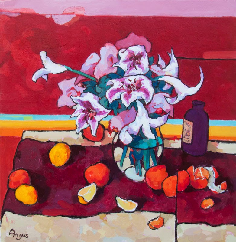
I like the conflict of geometry here, the circular table and rug pushing against the square angles of the background drape. Round against Square.

The painting proved a challenge to photograph accurately. I feel the red rug is actually a little deeper, with a slight purplish tinge. I think the photograph often struggles with the subtleties or red and warm ranges. It's one of those paintings that really shows well in person, but I know I'm biased.

Delphinium, fish & Oranges
40X30           Acrylic on wood

Detail

I though these flowers were worthy of a close up. I love the over sized petals in relations to each flower. The irregular, unique shapes of each flower formed by these big floppy petals, that stretch out on storks from a bed of broad leaved foliage. I tried to leave a lot of red under painting, within the petals, to help state and enhance the overall color.

Detail

I consciously kept this painting a little looser, more under painting was left than usual and forms were loosely defined. This detail illustrates that well. The Delphinium have very little definition with some lost and found elements that bleed into the background. The blue jug has very loose stylized coloration on the inside of it. Again this was achieved by letting a lot of the under painting remain.

Here are some stages of the paintings progress -

 The 'block-in', out line stage 
You'll notice I originally intended just one fish on the plate, and this was nearer the jug. Once I moved to the color plan stage, I began to feel the fish was too centrally placed in the picture. So I slightly off-set it, and added a second fish.  I needed additional fruit placement on the left to balance out the change.

The color plan
The proposed colors of the final painting. These quick color studies guide me as I complete my final painting.

The under painting
Under painting colors are chosen in reference to the final color plan. Both complimentary and secondary colors are used.

First pass on most colors. 
Still some refining and re-tuning of colors where needed. Notice how the tone of some elements changed, - such as the rug and flower pot.


Thursday, June 5, 2014

A fishy business

In all my years painting still lifes, I have consciously chosen subjects from (what I would call) the 'classic still life'. By this I mean,  a traditional bouquet of flowers or a plant, with a grouping of fruit and vegetables. For me there is still a wealth to be explored and said with these subjects and feel no need to move from this subject. (perhaps this is the topic of a larger blog post?)

That being said small dalliances are allowed. For example, I have always thought it would be fun to paint a modern interpretation of the 'game' still life. A pheasant, rabbit or even deer carcass draped over a table with much finery placed around the macabre scene. In truth the opportunity has never presented itself, so that will have to wait... But fish on the other hand are readily available.

It's taken me a long time to get round to it, but here is my first ever fish painting!

Fish, plums & a runner from Leon M
24X48                Acrylic on wood

And I enjoyed it, so who knows I may paint a fish again in the future, that is unless I stumble upon some other poor creature, shot and ready for the pot!

The runner and indeed the placement of a couple of the Japanese eggplants are loosely based on a painting by Leon Morrocco. I originally designed a rug underneath the table, but tried a number of color treatments before I realized it pulled and distracted too much from the table and and I chose to remove it.

detail

 detail

Thursday, May 15, 2014

2 man show in Santa Fe

Check out this link to my forthcoming show in Santa Fe, New Mexico with Ventana Art fine art gallery. The opening is on Friday the 23rd of May.  Looking forward to being there next week!


http://myemail.constantcontact.com/Botanica-Vivida---New-works-by-Angus-and-Frank-Balaam.html?soid=1101288866406&aid=-oB5R_y79hU

Thursday, May 8, 2014

Ginger Jar

Here's one from last week. It's nice to work with a warm palette again and on a still life. It's been a few weeks since I've done that. I tried to keep my edge and line work a little looser and rougher, may try and do that a little more as weeks progress.

Mellow warmth with Ginger Jar
24X36            Acrylic on panel

Tuesday, May 6, 2014

Friday, April 25, 2014

Alberto Morrocco

I've just finished reading a book on Alberto Morrocco (1917-1998),  by Atelier books. The artworks featured in the book were nicely reproduced and the text consisted of a variety of conversational interviews drawn together.

watermelon seller

In truth, it is only in recent years that I have stopped to consider this artists work.  I realize this view point may have been somewhat unfair, especially when you consider locationally we had so much in common. Both of us were born and brought up in Aberdeen, Scotland (though admittedly in different eras). He also taught at 'Duncan of Jordanstone College of Art' in Dundee, around the same period that I was a student there (though my types of classes never would have intersected his). Indeed, I should add, we may have just missed each other altogether; for he went back to Aberdeen to work at 'Grays school of art' around this time. 'Grays' was where he originally attended and learned fine art.

3 young clowns with birds

I mentioned having dismissed his work in the past, and I can only explain this as follows. I believe it's fair to say even in Scotland his work is not terribly well known, when compared to other Scottish peers from this period. The little I personally knew of his work, I felt to be derirative of Picasso. It was only in recent times when I came into contact with more of his paintings, that I realized he had greater depth than my previous views and there was a lot to love about his work.

Fishermen & boats

Within his work he is very technically proficient and quite varied within his treatments. In many ways he's most known for his paintings of the Mediterranean figure. Streets scenes, stalls, Watermelon sellers, sun bathers and men riding horses by the ocean are all common subjects of these paintings.   These works are filled with a light confident touch, but also a more contemplative understanding of form and composition structure. They demand attention;  he is an artist who understands that paint can be a powerful thing on its own, and presents confident color blocks and color relationships. He has a beautifully controlled careful brush stroke, with considered value choices. This when combined with his expressionist modern figure paintings give his work a strong power, and one that I regret overlooking for so long.


Santa Fe Chapel Study

A little study of a Santa Fe church. I love the Adobe style buildings in New Mexico, the architecture always seems so fitting to the environment. Looking forward to being back there next month!


'San Miguel Chapel study' 
Acrylic on panel    16X20

Friday, April 11, 2014

Energy and color

This painting is about energy and color. I see the style of it as an extension of my more usual colorist
style, however it has a clear modernist/contemporary aesthetic and mood. I enjoy painting in this style, with bold brush strokes and irregular expressionist color passages through the canvas. It gives the subject so much life and energy.


Painting animals is almost always fun, and dog portraits are great, (though I tend to find the tongue thing a bit of problem). Finding a moment when the mouth is closed avoids that, and there's still so much life and expression in a dogs face around the eyes, ears and brow.


 'Samuel after the goats' 
Acrylic on panel           24X18

The painting color themes were pulled from some goat paintings I did a couple of years ago (hence the title). Here's the old blog post of those, for those who are interested? -   

http://anguswilsonstudio.blogspot.com/2011/08/not-by-hair-on-my-chinny-chin-chin.html

Tuesday, April 8, 2014

Ghost Ranch

Next month I have a show in New Mexico with Ventana Gallery in Santa Fe, so it's got me thinking about the beautiful countryside in the state....

 Mesa Study (Ghost Ranch) 
Acrylic                  12X16